A Fresh New Look
|
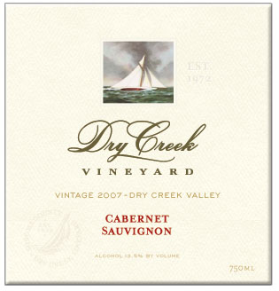
I am in the middle of a very exciting project and one that only comes around every so often a complete new label design! For those of you who are die hard Dry Creek fans, and love our sailboat labels, don't worry, I'm not getting rid of our characteristic sailboats (horrors!). Nor, am I going to some weird outlandish design, what I call the hey, look at me damnit label. (Lord knows there are enough of those out there.) And, I promise you no critters will ever grace our labels! Rather, it's a refinement of the original design and layout, with a revised use of the oil paintings that we had commissioned A project like this, for a brand like Dry Creek is tricky. We have years of brand recognition and very identifiable wine labels. And, we can't afford to screw it up! But, it's time we have a package that reflects the true quality and distinction of our wines. So while sailing and all things nautical are still family passions, I'm toning them down a bit to portray a more upscale and serious image. But don't think we're going to get all snooty and arrogant like so many others who've entered this industry. No way man. However a grown up version of our former selves is in order, given the serious quality of our wines these days. I'm also hoping to come up with a tagline that we can use. Something that captures the true essence and authenticity of our family winery and wines. So, if there are any brilliant word meisters out there, I'd love to hear your ideas! |
5 Comments
Leave a comment
welcome!
This is a blog about what it's really like to be in the wine industry...so sit back, take a sip and enjoy!

about me

our wines
our winery
our events
contact me
privacy statement

favorite posts
A Lifetime in Wine
Top 10 Traits of the Successful Family Winery
The Dreaded Family Meeting
Board Meeting Jitters
Is the Future of the Winery in Danger?
The Case of the Overweight Bottle
Wine and Dementia
Wanted: Talented (Normal) Individual for Family Owned Winery
A Sea of Wine
The Heroes of Our Industry
monthly archives
subscribe
Hopes & Dreams
Owning a Coastal Cottage
Sailing for 6 Months
Getting a 100 Point Score

Favorite Haunts
Coast of Maine
Dry Creek General Store
Dry Creek Kitchen
Healdsburg Bar & Grill
Spoonbar
Sonoma Country Antiques
Baci Cafe & Wine Bar
The Farmhouse
Istanbul's Grand Bazaar
Bad Ass Coffee
Bistro Ralph
Bits of Press
Food & Wine Magazine
The Wine News
Wine Enthusiast
Wine Spectator
Press Democrat
Sunset Magazine
Connoisseurs' Guide
Dan Berger's Vintage Experiences
Cruising World Magazine
Oprah Magazine
The Washington Post
Coastal Living Magazine
Wine & Spirits Magazine
People Magazine
SAG Awards Magazine
Forbes Magazine
Favorite Magazines
Coastal Living
Down East
Sunset
Country Living
Quarterly Review of Wines
Wines & Vines
Wine Spectator
Wine Enthusiast
California Grapevine
Connoisseurs' Guide
Practical Winery & Vineyard
WineReviewOnline
Vineyard & Winery Mgmt
Blog Buddy List
Fermentation
Hip Tastes
Pinot Blogger
All The Best
Julia Flynn Siler
Vinography
Winery Web Site Report
The Pour - Eric Asimov
Dr Vino
Steve Heimoff
Start Up Ladies
Good Wine Under $20
Blind Muscat
The Wineroad Blog
Gabe's View
Wine Peeps
Vici Vino
Cellarmistress' Cellar Talk
Uncork Life
WineVine-Imports Blog
The Wine Witch
SOURMASHED
Honorable Mentions
Fermentation
Wilma Hits The World of Blogs
Most Intriguing New Wine Blogs of 2008
Midwest Wine Guy
Winery of the Month
Julia Flynn Siler
Meritage wines - and a fascinating glimpse into family business
Winery Web Site Report
New Winery Blog: Wilma's Wine World
Start Up Ladies
Insider's View of Family Owned Dry Creek Vineyard
The Glue that Keeps the Whole Thing Going
Atlanta Dish
Blog of the Week
Blind Muscat
The Merits of Meritage
Wineries.net
Boston Wine Expo exhibitors, and the reason why winemakers are so darn happy
Dr. Debs said:
September 12, 2008 2:34 PM
Kim, I LOVE the new label! It's not that I didn't like the old ones, but they did look a bit dated somehow--can't quite describe it. But the boat and the script style absolutely still say Dry Creek to me. Nice.
Jack said:
September 13, 2008 5:13 AM
The new label has the vintage way too small (and too light); you'll not be able to read this in a restaurant that isn't well lit. A serious design flaw.
(I also think pairing the text "Dry Creek" with an image of a sailboat on the sea for a wine bottle is Not The Best Choice.)
Mike McCracken
September 13, 2008 7:40 AM
First - about the sailboats. Other products could be spunoff with a rowboat, canoe, cruise ship, tug, etc. as fitting for the specific wine.
Do you plan to push the vintage year or to blend for continuing top quality? This may influence how prominent the year is displayed. (I concur with the importance of testing the readability of the label in a darkened restaurant, although some are so bad I carry a small flashlight to read the menu and check the wine.)
Haiku for you: The wine inside is/ the delight for your taste buds./Drink responsibly!
Kim (aka Wilma)
September 14, 2008 10:54 AM
Great comments everyone! I'll definitely take this design into a dimly lit restaurant. Keep in mind, this is not a printed label, merely a comp of the final design so the type will be much more ledgable after it's printed.
JohnLopresti
September 19, 2008 10:46 AM
I think the thread commenter's idea of the boat series insightful in a funny way. Having enjoyed a few hours on a few boats of design both old and new, I conceptualized what I would do to stylize and modernize the DCV cab label based on Wilma's excellent art in the post. Then I returned the next day to review Wilma's work again, with a fresh understanding of the effort that inspires label remake. I like the idea of preserving in a simple central top portion of the new label the old romantic sea sailing design. I note the spinnaker is unfurled. But the new look has the flavor of some of the regal presentations of the chateaux which occupy lands granted for viticulture to owners centuries back. It seems a good, appropriate launch for the stately DCV flagship cab.
During this journey I spent a while on some maritime museum sites as well as those of some current regatta sponsor ports, some of which are enlivening.
I think there is room to expand the theme, and Wilma, and Dave before, have provided interesting direction in the artwork's morphing. Good job.